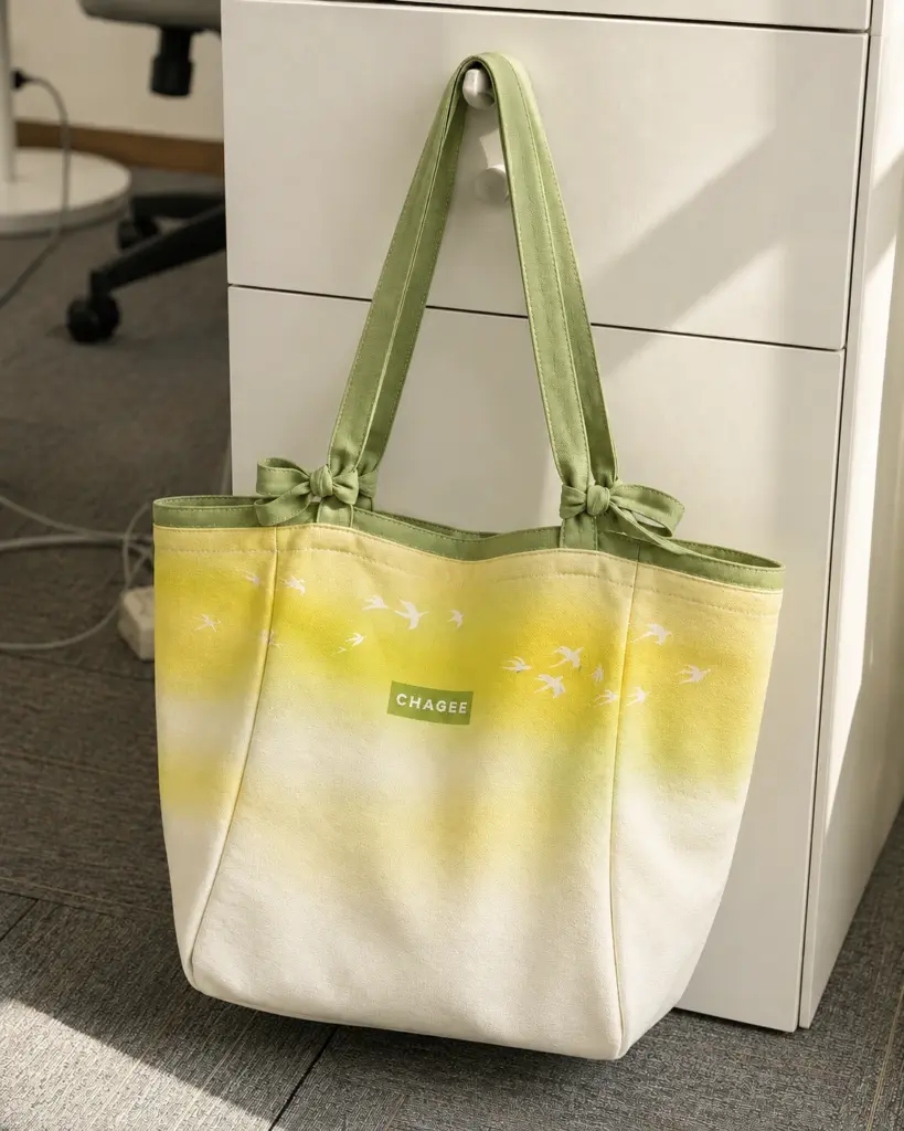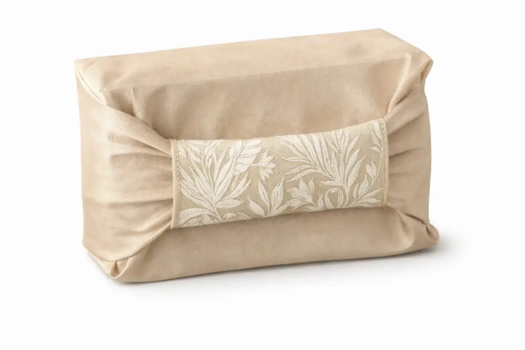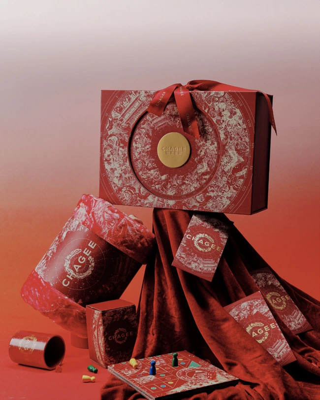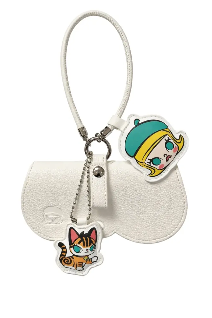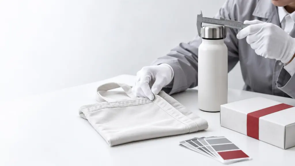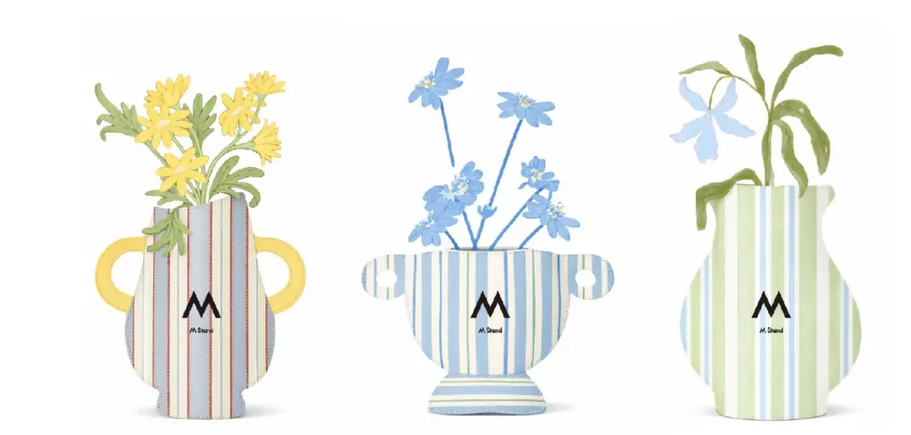
A gift collection can combine textiles, printed paper, packaging and accessories. Colour helps these pieces feel connected, but each surface has its own appearance. A clear colour reference is the starting point for a conversation, followed by review of the actual samples.
Agree the reference everyone will use
Share the current brand guidelines and identify the colours that matter most. Clarify whether a reference is intended as a strict requirement or a direction for development. Make sure the designer, product developer and approver are working from the same version of the brief before artwork is prepared.
Review materials together
A colour seen on fabric may look different from a colour printed on a box. Surface texture, finish and the surrounding colours can change the impression. Place the relevant samples together during review and decide whether the whole collection feels coherent. Avoid making the final decision from separate photographs alone.
Record the approved combination
Keep a clear record of the approved artwork, colour references and samples. If a material or finish changes, check whether the colour direction needs another review. Explain which pieces should closely match and where a complementary tone is acceptable, so the production brief reflects the actual design decision.
Check the complete presentation
Look at the gift with its packaging, printed insert and any small accessories. A detail that looks right on its own may feel different beside a larger surface. The final review should consider the same arrangement the recipient will see. Agree the acceptance criteria with the team before production moves forward.
A useful checklist
- Current brand guidelines
- One agreed reference for each key colour
- Materials reviewed side by side
- Recorded sample and artwork approval
- A final view of the complete gift